Tag: AMP

Use Of Responsive Web Design To Boost Conversions

Use Of Responsive Web Design To Boost Conversions

With the changing technology every day, the accessibility and awareness of technology have increased amongst the users tremendously. The technology has reached people in various forms and devices. Depending upon the affordability, people own different types and sizes of devices.

Due to the increased awareness, accessing the social media, online shopping and browsing internet has become a habit for almost every person, whether he is coming from the corporate world or is a student. In the light of this, it is quite not possible that the websites are designed separately for each device type and compatible with the software used on the device.

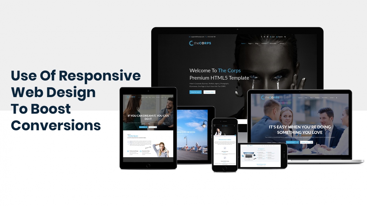
Responsive web development takes care of the variations concerning the screen sizes and the software applications by adapting itself to the different devices. Responsive website design enables the users to access any particular website on any device without any hassles.

Responsive web design services should be in conformity between the design and development. The user’s action and environment depending on the type of devices, mechanism and arrangement should be taken into account while developing a responsive website. The highest accessed web search leader, Google has affirmed it prefers to use responsive web design as the mobile configuration.

Most picked cues for creating a responsive website design effectively

Approach based on mobile devices

Due to the changing technology, every individual affords to own a smartphone or portable tablet device for keeping himself abreast of latest developments. So, it becomes imperative to target the audience owning the mobile/tablet devices for designing of the responsive website.

Emphasis on the touch technology

The latest smartphones are produced based on the touch-enabled design. The touch technology enables smooth navigation through mobile for the users. Designing of buttons for easy selection and click can be efficiently created for navigating the page in all directions using the touch technology.

Employ Design Prototyping Software

Design prototyping software is primarily used to provide actual time performance, the record of changes, mapping the audiences. The software simplifies the interaction between the client and the designers. It becomes easier to analyse the responsiveness and interactivity of the website design.

Bootstrap – a free and open-source front-end framework

Bootstrap is a front-end web framework used for designing of websites and web applications. Bootstrap supports responsive web design in which the layout of web pages changes dynamically, bearing in mind all the features of the device used e.g. desktop, tablet, mobile phone.

Google’s Resizer Tool

The Google’s Resizer tool offers the capability to test web design across different platforms and devices and identify the breakpoints therein. Resizer is a helpful tool used to modify the web designs apt for various devices.

Responsive Web Design Typography

Responsive Typography is introduced in Responsive Web Design such as column width, type size or line height across various devices to use of graded fonts that match with the tone of the website.

Media Queries

Media Queries is useful in deciding the width of the design layout in disparate devices. Three media queries should be determined for a web design considering mobile, tablet and desktop.

Fluid Grids Layout

In a responsive web design, the layout of a website needs to respond and adjusts to the size of the device on which it is laid out. A fluid grid layout presents a visual approach to create different layouts analogous to devices on which the website is visible.

Effortless Navigation

Without having an effortless navigation, it does not matter how creative the website is. Navigation within the responsive design is distinctive because there are varying screen sizes for which the navigation options need to be provided.

Enhance the creativity of website

In order to engage more audiences to the website, it is essential to create an attractive content and layout. The content and layout of the website including images to the typography must be aligned with the theme of the website with a spark of creativity.

Content congestion

Too much of a content can destroy the creative look of a website. The information presented on the website should be useful, relevant and placed in an organized manner. The content should be structured under appropriate captions that hold the interest of the users.

Retaining Quality with Efficient Download Speed

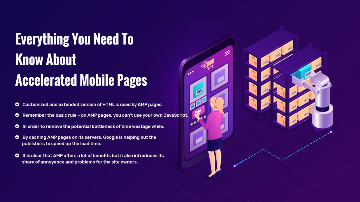
Users want to have high-quality images loaded fast on a webpage. In order to attract more audience to the website, it is essential to integrate Google AMP to enhance the SERP for faster loading of the webpages.

Flexbox

Flexbox is a container that holds internal elements. Flexbox is extensively used for mobile devices and responsive content for influential layouts and web apps. The internal elements are left fluid and are not given definite width values but instead, the content adapts with the page based on proportions.

Material Design framework

Material Design Framework is a user focused approach which utilizes elements and principles of Material Design. Using Material Design, a framework can be created that integrate components and animations for providing additional feedback to users.

Along these lines, it is acknowledged that creating a responsive website is a prudent initiative for building an attractive website and at the same time getting higher conversions by applying the above-mentioned cues.

Everything You Need To Know About Accelerated Mobile Pages

Everything You Need To Know About Accelerated Mobile Pages

There was a time when websites were simple with just some text, a few images, a couple of hyperlinks and no video. With no single page applications and minimal interactivity, web pages were just pages. It is hard to believe, but yes the old internet is back.


The AMP Project i.e. Accelerated Mobile Pages Project is an open source initiative championed by Google and is supported by a lot of big publishers. It targets to quickly deliver web pages to mobile users. Mainly aimed at news publishers, AMP web page can be built by anyone and it works in virtually all modern browsers.

The growth of web pages and its bad affects on mobile visitors

In the old days, web pages were chiefly there to deliver information but now the time has changed. The modern day web pages are big and packed with variety of useful features such as animations, videos, dynamic content and instant chat windows. The only trouble now is that inclusion of so many features is making the web slow.

To overcome the sluggishness of websites, faster broadband and clever prerendering does not serves the purpose completely because not all the users are blessed with decent or fast broadband connection. Also, these days mostly people browse web on mobile phones and devices which is exposing us to realities of browsing the web in 2016. With timing out of connections to third party, forms not able to complete, slow loading and execution of JavaScript files, phones struggling hard to afford oversized images, it is clear that the world where we want to be is far away.

AMP comes to our rescue in such a scenario by stripping away unnecessary content. Below are some of the features of AMP

AMP HTML

Customized and extended version of HTML is used by AMP pages. Some unimportant elements are removed or replaced and new elements are introduced making it convenient for the visitors to load images, videos and other animations without wasting much bandwidth and time.

Javascript

Remember the basic rule – on AMP pages, you can’t use your own JavaScript. But this does not true that AMP pages are JavaScript free. In fact, on every AMP page there is a JavaScript library which has to be included. This AMP JavaScript is loaded asynchronously and is designed in way to make the web pages faster.

For getting your own JavaScript on an AMP page, all you have to do is to use an iframe. Usage of AMP iframes is restricted to some extent, one of which is they cannot be used on the top of the page. Still you are free to add some level of interactivity like embed social media posts, create lightboxes or add in analytics.

Pre-rendering

In order to remove the potential bottleneck of time wastage while JavaScript loads and executes, prerendering is a trick which comes to rescue. It involves loading of a web page in advance so that the visitor gets an impression that AMP pages loads instantaneously when he clicks through it.

Often by default traditional prerendering is disabled on mobile when CPU and bandwidth is limited. Now the question arises how is AMP prerendering different?

Here comes a simple answer. As AMP pages are fairly light and only above-the-fold portion of the page is prerendered, this mitigate the negative impact. Also, the cost of AMP prerendering is not too much so it is feasible to multiple AMP pages.

Google AMP cache

By caching AMP pages on its servers, Google is helping out the publishers to speed up the load time. If you do not have access to a good comparable network for getting your AMP pages in front of the end users quickly, this can be quite useful as it gives you access to a free CDN i.e. content delivery network.

The extra maintenance – crucial deciding factor

It is clear that AMP offers a lot of benefits but it also introduces its share of annoyance and problems for the site owners. This is mainly because they now have two sets of pages to be maintained. A significant number of sites will have dedicated mobile pages.

Fortunately, to make the process run effectively and smoothly, there are one or two solutions as well. One of which is AMP PHP Library. With less reliance on dedicated apps, via a browser we can access versatile web.  

Any SEO benefit?

It is quite reasonable to assume from the facts that Google will prefer an AMP page over a non-AMP version of a page however there is no such indication.  When you search something on a mobile device, Google takes in account the complete preview of AMP pages in the result page. A small lightening icon is displayed under each and every result. Now, users might end up associating this with fast loading of pages. This might incline their interest to the pages that features it.

This gives rise to some very interesting questions.

As mentioned above that AMP is best for news sites, it is not designed for ecommerce. If you  search something specific to news, the results will be the set of AMP pages from leading broadcasters and newspapers while if you search something which is generic like “clothes”, you are directed to retail pages which are not in AMP format. In short, there is an overlap.

Do we really need AMP?

There is no magic in AMP and but you may want to still consider it for the two things it offers. One is the set of incentives and the other is convenience.  Google will give you access to its proxy cache and special treatment to your pages in search results. Yes, you have the freedom to write your version of AMP pages. However, give it a thought again. Much of the important functionality has been removed; some has been given back to us to minimize the impact on its performance. There are some people who have taught us how to build a simple web page which works very well on mobile. Consider and judge the whole scenario in this way, so long as you are free to create the kind of content for which AMP is designed then why not make the most of it.
 

Do you need to make your website pages AMP? Contact Us and get a quote.