Tag: responsive web design services

Top 10 Reasons To Embrace Responsive Web Design

Top 10 Reasons To Embrace Responsive Web Design

With the astronomical growth of mobile phones, no mobile strategy means lurking the business future in the dark. Presently, no business can afford to move in the direction opposite to the customer trends, market conditions, and advanced technology.

With the astronomical growth of mobile phones, no mobile strategy means lurking the business future in the dark. Presently, no business can afford to move in the direction opposite to the customer trends, market conditions, and advanced technology.

This is a mobile world, where the mobile sale and mobile usage have overtaken the desktop. It indicates to grow by leaps and bounds, going mobile way is all-important for the businesses. The websites the business are using to showcase their services and offerings online must be mobile-friendly.

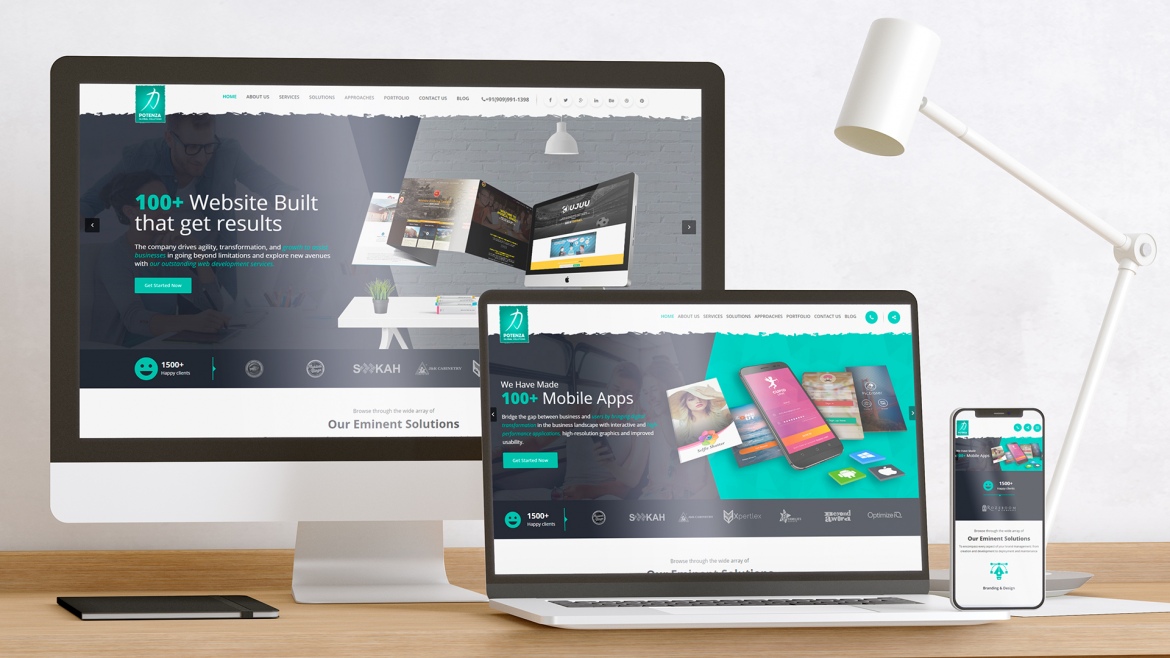
That’s where responsive web design is the best solution, which businesses should employ to alleviate the need of creating different websites for distinct devices. 

Take a look at what are the benefits of crafting responsive websites:

1) Enrich user experience

When the users can browse the website on any device without zooming or scrolling the content, the user experience gets improved. The consistency and the adaptability to various screen sizes build the brand and increase the brand recognition. 

2) Updation becomes a breeze

Making changes to multiple websites is time expensive, but with a responsive website, the programmers need to make changes just once in the coding, and the modification gets easily reflected on all the websites running on different devices.

3) Good performance

The responsive website design collects more brownie points at loading speed. The mobile optimized website must load within 2-3 seconds, else the users get frustrated and leave the website. Additionally, Google standards have mandated the high loading speed as a crucial factor to get the website to the top position. 

4) Saves huge dollars

Building the websites for every device is neither a good alternative nor every business can have the funds for. Here, the responsive website turns out to be highly economical wherein at the cost of building one website, multiple websites get built.

5) No content duplication

The content duplication is marked as negative by the search engine crawlers, and when different mobile websites are built, the crawlers get confused and as a result, the SERP gets impacted. Certainly, this won’t happen with responsive websites. Thus, you are saved…

6) Easy Sharing 

Ranking the website to the first position includes several parameters and link building is one of them. For high-quality link building, the businesses need to maximize the sharing and promotion of the website link. With responsive website development, just one link is shared and all link juice gets redirected to one domain.

7) Google recommendation

In 2012, Google made an announcement that the website with one URL and the same HTML code would get easily crawled and indexed by the bots. Moreover, the improved user experience and loading speed are also taken into the consideration by the Google. Engineer the responsive website, if you want Google to like your online presence.

8) Build the website for future

The responsive designs are highly adaptable, which works impeccably, regardless of device type, screen size, and platform. It implies when the responsive website is built, it will work immaculately on all the devices to come in future. 

9) Gain mobile traffic

The mobile has become one of the valuable assets that enable everything at the fingertips and that’s the reason more and more people are going mobile. The responsive website is a great treat for the businesses as they will be able to gain the mobile traffic as well, in turn, the reach to the customers get increased. 

10) Guaranteed ROI

The responsive require less maintenance during the whole lifetime, and the investment made in the responsive website development would really pay off as 90% of the mobile searches leads to an online shopping or the business website visit. It indicates the customer outreach and conversion get improved as opposed to competitors with a responsive design.

Conclusion

In this mobile world, where the plethora of apps is found for every need, going mobile allows businesses to step in with the trend. But, it’s not optimum in the ever-evolving technological world. The businesses need to stay ahead of the game by upgrading with the changing technology, market and customer needs.

That’s where responsive website excels, which covers all the factors that will be advantageous to all the stakeholders. Deliver efficient services alongside great experience by teaming up with outstanding responsive web design services.

Responsive Vs Mobile-First Web Design-What Will Be In Fashion In 2017

Responsive Vs Mobile-First Web Design-What Will Be In Fashion In 2017

The world is shifting into new orbits with the advancement of the technology and this transformation is towards mobile-first strategy.

Well, it doesn’t eliminate the desktop development, but the businesses are certainly leaning towards responsive applications. It means more mobile usage for browsing distinct websites.

According to E-Marketer, “Nearly 2.6 billion people over 1/3 of consumers worldwide will use Smart phones by 2018.”

So, Mobile Responsive Website = High ROI.

This is a story of mobile influence over the diverse industries.

For an average Joe, the ability to browse the website on the mobile device is a great experience. What they all need is the website is mobile-friendly. They never think about whether the website is responsive or mobile first developed.

But, to an entrepreneur, the scenario is different. They prefer to develop a responsive website that creates mobile-first experiences. The two designs are so intertwined that muddies the water. Actually, both responsive design and mobile-first design cannot be alternative of another, while they are different.

Let’s clear up the air:

Responsive website design is actually one size fits all solution where the website design appears similar on every device in terms of look and feel. On the other hand, mobile-first website design is a device-specific approach that mainly focuses on how the website looks on the mobile screens.

A long debate is going over the widespread issue to determine which will help businesses to stand out in the market. Here, we have outlined certain factors based on the research that will help you know what will stay in fashion in 2017. They are:

(1) Optimize for User experience

The responsive design can be fit well with any screen size, resolution and mode, be it a 20’ of monitor, 15’ of laptop or 4’ of the smart phone. This all is possible with a single code base that’s awesome. But, displaying the same content across all the devices impact user experience. See how.

“Nearly 8 in 10 of consumers would stop engaging with content that doesn’t display well on their device,” according to Adobe.

On the Desktop screen showcasing a lot of content at once is readable, but not on the smaller screens. It matters to the target audience. When the content is also optimized for good user experience, responsive design incurs extra time and efforts.  

Instead, the mobile-first are already designed keeping mobile users in mind where limited content is displayed on the screen at once that’s perfectly readable by the users.

(2) Possible navigation

The responsive web design services are considered as appropriate for corporate website, media website, blog website, news based website or location based services where users generally prefer to scroll top to down on every device.

Instead, the responsive web design is not a cup of tea for retail or entertainment websites, as the users prefer to scroll from left to right in place of top to bottom. However, it’s possible in responsive design with customization, but that again it calls for more efforts.

With mobile-first design, both types of navigation are enabled either you want to incorporate left to bottom or top to bottom.

(3) Google is also judging

The web surfer may give the responsive design or mobile-first design an afterthought, but not the Google-like search engines. Well, the search engines also never get biased with responsive design or mobile-first design and never deduct ranking points considering this criterion.

Instead, the user experience that responsive designs or mobile-first design offer matters to the search engines and based on them the websites are ranked.

(4) Development cycle-which takes a long time?

The website development has become obsolete while it’s the trend of responsive website design or mobile-first design. Developing the website according to latest fashion require more time and efforts. However, when we are going to compare the two, the responsive design engineering wins.

Yes, although it’s a famous notion for the responsive design that with one codebase the website optimized for all devices can be built, but this is the half truth. When the complex menus, left to right navigation, or content optimization is implemented the responsive design development time gets elongated and takes more time as opposed to mobile-first design development.

(5) Design complexity goes up

As already discussed the responsive designs that appear simple to design may demands a little more effort if the website design is complex. But, it’s feasible to make things done.

For mobile-first design development, the trained professionals are needed who are well-versed in the underlying technologies like- HTML5, Sencha, jQuery, JavaScript, CSS and other, that’s difficult to find out. Moreover, the app features versatility and complexity gets increased for touch-enabled devices.

The verdict

Engineering the responsive design or mobile-first design is like a chicken-and-egg conundrum. Picking up the one is not fair because the existence of one in the absence of another is not feasible. Going responsive lets you design the website boundlessly and bring your ideas into reality while jumping onto mobile-first design initially won’t let your developers waste efforts in the area which is not required.

Both website design trends have their own pros and cons. It’s good to check the things you need and then refine down. Later, at the point of intersection, decide what you actually need of.

What are you going to hire responsive web design services or mobile-first design services? Decide and go ahead with what you want to approach.

The Most Amazing Web Design Trends of the Coming Year

The Most Amazing Web Design Trends of the Coming Year

Web designing has always been a dynamic and most appraising dynasty and there is s lot more scope in the web designing arena.

Everyone needs a latest web design to make their product reach to the outer station of the world therefore the design for the marketing would be in such a way that will make it look appealing and creative. Since we see that the trends are oscillating every now and then therefore it is obvious that the common thing will not work according to the plan. A website is made through various coding done to make it look appealing.

Let’s see some example:

  • We all know that Google is a search engine but definitely it has a Website and the website of the Google is simple and most resourceful. So it is necessary to keep in mind that the design of the website should not be over collaborated in a way which will make it confusing and difficult for the person to understand.
     
  • Therefore keeping all the responsive website design makes the process simple and easier.
     
  • The coding for any website would rather remain basic but you can always add different structure and design to innovate it with different idea.
     
  • Every website differs from each other. Like websites are generally created to advertise and also to make the best use out of it.
     
  • There are different types of parameters which has to be kept in mind in order to make the websites look better and easily accessible.
     
  • The first and the most important thing to keep in mind are to make sure that the website must be user friendly and it should have a good user interface. Since these days people are more accessed to use the mobile phones Therefore it becomes easier for the users to get the access to the websites. Usually these days the website follows the concert of making the website according to the mobile user friendly interface.

You can even make your website look beautiful and more creative by adding different kinds of creative and user friendly stuff to it. The websites are utilizing some of the brightest and common colors to add it to the website and make it look rather appealing and promising.

You can easily add Animations to your website. Since everything is done by phone therefore it becomes important that whatever the user experience on web the same they should experience in the mobile website too. These days adding the typography as the vision is rather powerful and more effective to create a better user interface for over sized data to be loaded.

The last and most exciting thing that you can add on to the website is to add photographs. Photographs have really been some of the best ways to counter things and also make the website better and look best. It helps to add some special effects to the web site and also you can make it really interactive.