Tag: Responsive Web Design

The top responsive features of a multipurpose WordPress theme: The Corps

The Corps - multipurpose wordpress theme

When creating a new website, you are presented with a number of different options for themes. Your choice of theme will have a big influence on the look and performance of your website, so be sure it doesn’t hinder its development in any form. You can either choose a niche-specific theme or a multipurpose WordPress theme for your website development. 

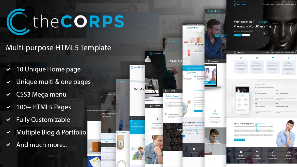
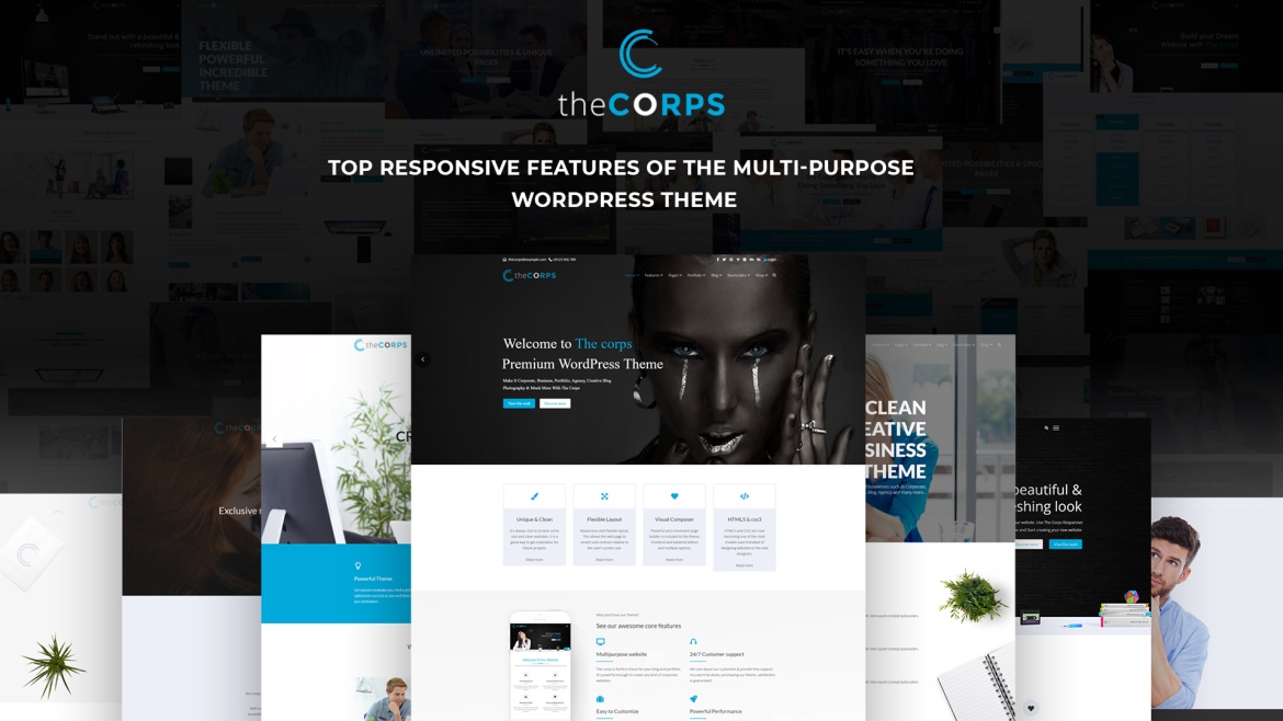
The fact is that both versatile and specialized themes are beneficial depending on the kind of project. If you want to create a certain sort of niche site, for example, starting with a theme built for that purpose might be beneficial. However, for large-scale projects and the most prevalent kinds of websites, a multipurpose theme like The Corps makes more sense. This sort of theme generally comes with a large number of choices to choose from. This allows you to utilize a single theme for various projects and further modify it to meet the needs of a given site. 

In this article, we’re going to dig deeper into some of the top responsive features of a multipurpose WordPress theme. Keep on reading to know what they are.

Must have responsive features in a multipurpose WordPress theme

Customization of the theme 

Using a pre-designed theme might help to build a website more quickly and easily. Still, many individuals want to bring their style, so customization — from font to color to basic design changes — is essential. The live theme customizer in WordPress 3.4 and later allows individuals to add these sorts of changes fast, by the element, and view them instantly. 

Ready for Retina Displays 

With more consumers purchasing smartphones featuring HD and retina displays, picture and video quality have become more important than ever. This is also applicable to WordPress themes. The number of retina-ready alternatives available is increasing every day, and it is rapidly becoming a desirable feature. 

Themes that support the Retina display will look fantastic on any device. Not only will the visuals be clearer and sharper, but so will the typefaces. When zoomed in, retina-ready themes offer superior resolution and allow for more detail in the entire design framework.

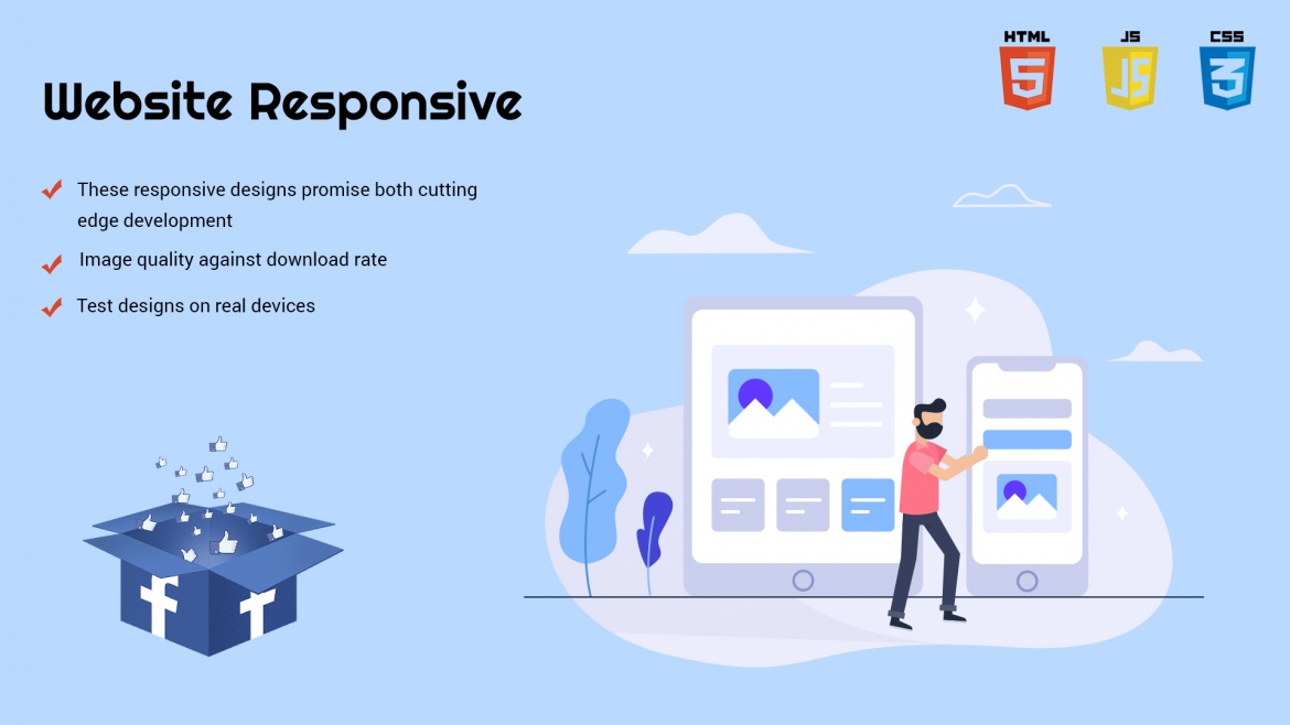
Responsive Website Design 

Responsive design is the most important characteristic of all websites, and it is also a must for WordPress themes. With so many people accessing the information on smartphones and tablets, choosing a theme that allows users to see content clearly on any device is critical. 

The major advantages of using a responsive theme are that you won’t have to manage numerous websites or information, and you’ll have graphic and user interface consistency across all platforms. 

Compatibility with the Most Popular Web Browsers 

To obtain the most return on your investment, ensure your selected theme is compatible with all browsers. Many people in today’s society prefer to open Website pages using multiple browsers. Despite the popularity of Chrome and Firefox, a surprising number of people do not like them. 

The finest multipurpose WordPress themes function on every browser, regardless of whether it is a mobile or Website version of the browser.

Codes that are free of errors 

A good multipurpose WordPress theme comes with shortcodes that allow you to quickly build amazing components. The shortcodes utilized in designing a Multipurpose WordPress theme allow the websites developed with it to load rapidly. It’s never been easier to add design features with custom code while enhancing the user experience. 

Ready for translation 

There are a lot of WordPress sites that aren’t in English. You could be working on a website that isn’t in English. Perhaps you have future intentions to develop a multilingual WordPress site. When you have a translation-ready theme and decent translation plugins, this isn’t a huge problem. 

A good multipurpose WordPress theme like The Corps is translation-ready as it supports translation plugins like WPML. 

Recommendations from Us 

There are a plethora of free WordPress themes to choose from, with new ones appearing on a regular basis. But simply any WordPress theme won’t work. 

As previously mentioned, one of the most essential factors to consider when choosing a theme is to check if it’s multipurpose or not. A good multipurpose WordPress theme like The Corps has all the essential features and functionalities to build almost any kind of website. 

The Corps-The Ultimate HTML5 Template With MultiPurpose Functionality

The Corps-The Ultimate HTML5 Template With MultiPurpose Functionality

The CORPS is an elite multi-purpose 100% responsive format with capable components. Basic and very much organized coding, high caliber and adaptable design, versatile components alongside shading plans, this can be put to effective use to make tailor-cut sites.

With bootstrap, responsive uber menu and different formats including unbelievable online journal topics, The CORPS offers you unimaginable availability to fabricate excellent and client situated websites. Exceptional plans, eye-appealing portfolio and imaginative site building devices work consistently to support your business on the web.

This format is intended for a wide range of organizations, for example, Corporate, Business, Portfolio, Creative, Blog, Agency and some more. You can customize as indicated by your business or customer necessities with a definitive components. In today’s world, customer-oriented websites are a must and for the creation of the same you need an outstanding accessibility which is ideally provided to you by The CORPS.

The template is bound to contain more than a hundred HTML5 pages which will surely leave you spell bound. You can get different kinds of multipage home layouts which provide a unique look to your website. 5 magnificent corporate layout options are available to you so that you can include them in your website page. Also, there are multiple options for a single page home layout which will add to the innovation and differentiation of your site. The features of The CORPS CORE are too something to look out for. Below stated are some of the features of The Corps Core which will impress you in an all new way:

Responsive and Retina ready

The Corps is designed in such a way that it can reduce as well as increase its size so as to suit your screen. This makes it look amazing on nearly all devices.

Inclusion of the slider

This also includes within itself, a revolutionary slider plugin which will create an everlasting impact on the customer viewing your website.

Supporting browsers

All the major and widely used browsers like Safari, Mozilla Firefox, and Google Chrome etc. are supported by CORPS which is another addition to the advantages of The CORPS.

Commendable Code

The CORPS has been designed to stand amongst one of the most outstanding HTML5 template. The code of the same is clear, commendable and a lot clear.

Layout Options

There are many options for layout available for instance the blog as well as for the portfolio layouts too.

It is a detailed documentation. There are other remarkable features of The Corps Core which shall be of great benefit to the created website. This can definitely be used to create an out of the box website.

If you want to buy this ultimate HTML5 theme then you can download it from Themeforest.net

Contact Us to our potenza global solutions designing team to design such a fabulous templates for your website.

Top 15 Trendy Web Design Tools Every Designer Must Use In 2016

Top 15 Trendy Web Design Tools Every Designer Must Use In 2016

Web Design tools are very important for an entrepreneur who wants to get his website made. Implementing these web designing tools in your website will help you progress in your business.

In the article below, we have listed 15 such web designing tools which are in trend in 2016, inexpensive and will also help you establish your business well.

UX Gofer

UX Gofer is the best tool that can be used to collect information based on User Experience Research. This research includes various tests like focus groups, usability tests, user interviews, etc. UX Gofer provides various test plan templates through which you can gather all the information based on various studies.

UXPin

Sometimes, there is a need to record hi-fi animated prototypes. In such cases UXPin comes into existence. With UXPin the complete procedure of creating the animated prototypes becomes very simple and takes very less time.

TryMyUI

This is a very useful tool as you come to know how your users are actually using your website. TryMyUI provides you with a video where you can see how the users access your website. This information will help you maintain and grow a strong customer base.

TypeForm

TypeForm is a very interesting web designing tool with the help of which you can create almost everything, starting from a simple form to a complete app. This platform is web based and it also eliminates the effort of coding by the developer.

Silverback

Silverback lets you record the video of the user, mouse clicks and also the audio. After the recording is done, one can edit the videos and also tag in it. This can be used for export purpose.

ProtoSketch

This tool is mainly used for designing the logo, icons and other vector graphics. One can also design UI and UX with this tool.

Reframer

Research work is made easy with the help of Reframer. Using Reframer for your research will not only improve research traceability but also help you enhance the patterns and themes discovery.

Project Comet

Project Comet is a great tool to create a blue print of your website. It makes designing quicker and easier. It brings together, in one pack, all the solutions for UX designers.

Proto.io

If you are looking forward to improve your skills of prototyping, then this told is definitely meant for you. There are several resources like documentations, videos and forums through which you can learn at various levels.

Principle

Nothing can be better that Principal for giving your website an interactive look with beautiful interface designs. It makes the whole designing experience easy and fun to use.

Marvel

This is a completely free tool which comes along with a demonstrative video for creating realistic web prototypes. It helps you create prototypes quickly and easily.

Atomic

Creating prototypes and designing them is a big task which is made easy using Atomic tool. This tool not only lets you design your prototypes but also lets you share them very easily.

POP

POP is a tool which takes your imagination to some another level altogether. This is meant for all those who have some creativity in their mind and want to bring it alive into their prototype.

Appsee

Customer is the pillar on which your app or website rests. Satisfying them is the first and foremost requirement of the developer. So, Appsee is one such tool which will help you maintain a healthy relationship with your user. It is used to analyze the user behavior so that you can work accordingly to provide what the users are looking for.

Ceros

Creating attractive banners, magazines, e-books, infographics and microsites is now made easier with the help of Ceros. This is one of the best tools for designer who want to make their websites attractive as well as interactive.

Make your dreams alive with catchy web design ideas with us. Contact us to get affordable web design services for your business.

Top 10 Key Rules You Need To Follow While Making Website Responsive

Top 10 Key Rules You Need To Follow While Making Website Responsive

In today’s high-tech world being flooded with gadgets that comes in numerous sizes, responsive web designing is gaining preference for designing websites to make it multi-device friendly.

These responsive designs promise both cutting edge development and impressive functionality designs. This article points out 10 best responsive design practices for web developers.

1)Plan for ALL sizes

The driving force for the megahit of responsive design is creating a better interface for mobile users. Its benefits have been so much hyped that the thought of creating an equally good interface for larger displays has taken a backseat. In recent years majority of the website visits are from mobile devices and hence the need to optimize web designs for mobile users. However, web developers should keep in mind that a good percentage of people still visit websites using larger devices, including those users that switch between small and large screens throughout their day. Hence a careful developer must focus on the larger displays too, while improvising on designs for smaller screens.

2)Consider the contexture

An efficient, responsive design not only encompasses the “size” fitting requirements, but also the content of the website. A website that is flexible for all kinds of devices be it small or large but lacks proper context will fail to hold onto visitors. Therefore the website must include relevant details that the people visiting the website are looking for. For instance, a restaurant website must comprise in addition to locations, menus, prices other interesting details like the nutritional information for the foods being served there. When developing a responsive design site, the designer must communicate with the project’s team about the kind of information obtained from a customer’s site visit and how such data can be integrated to build a better context.

3)Thoughtful deduction

When designing a responsive design site the developer must focus on contents or information that is most essential for the visitors and to remove anything that is irrelevant. As for the people using mobiles to browse website, look for key facts and given the small size, incorporating all facts and features is unnecessary. But, the designer has to be careful that the features eliminated for mobile devices won’t be necessary for larger devices. Hence the designer must have an aggressive approach to discarding anything that requires an argument to stay while still being able to produce optimized content.

4)Content priority

While multiple columns on a large screen can display more features than a single column on a small screen, responsive designs for websites demand prioritizing contents differently for different devices.  This can be achieved by changing the layout or removing editorial images. Thus images that would look appealing on larger screens but aren’t critical for the contents being displayed on smaller devices can be removed without modifying much of the contents.

5)Navigation

Navigation is a challenging task when creating responsive design sites. It has to be designed in such a way that it doesn’t crash when operating from one device to another. One must be very consistent in developing responsive designs so as to give users a similar experience but at the same time different functionalities essential for different devices.

6)Image quality against download rate

While websites display high-quality attractive images, downloading such big files becomes annoying as they remain half open or take forever to load adding. Designers must work to strike a balance between incorporating high defined images and boosting page performances. While developing responsive designs consider individual images and go for thoughtful deduction thereby boosting download rate.

7)Appropriate Iconography

Using icons wherever possible can make responsive design websites look both attractive and eliminate detailed texts wherever space is a priority. Icons can be incorporated into responsive design websites using SVG file format as they can be easily resized according to specifications of multiple devices and not adding up to file size of images.

8)Font size

Typography is an important ingredient for responsive designs. While creating these responsive designs, choice of font type is critical as it changes along with change in layout. So, care must be taken that they can be easily read on both smaller and larger screens. Thin typefaces works fine on larger or medium screens, but becomes difficult to decipher on smaller scales.  16pt body type works fine for all display sizes.

9)Input methods

Different devices have different input styles. Desktop users work with mouse and keyboard while mobile users do all that using touch techniques. Responsive designs require developers to design buttons, icons and clickable areas bigger in size for smartphone users.

10)Test designs on real devices

Once an efficient, responsive design has been created it must be tested on different devices like smartphones, tablets, desktops and handled by various users to see how well it operates and whether any defects exist or any improvements have to be done.

Read more about the web designing tools to make website responsive and user-friendly.

These are the valuable rules which every designers need to follow to make website responsive. Contact us to get quality resonsive web design services for your website to boost your website performance.