Responsive

10 Top Tried-And-Proven Tips To Run A Woo-Commerce Site Successfully

10 Top Tried-and-Proven Tips to run a Woo-Commerce site successfully

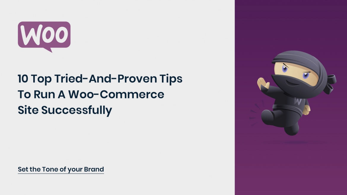
WooCommerce, a free plugin that lets you sell products and services from your WordPress site. It was acquired by Automattic Inc., WordPress’s principal company recently. It is one of the best-designed e-commerce plugins for WordPress and is considered as a most popular eCommerce solution across all websites.

So now that you’ve implemented Woo-Commerce to your responsive eCommerce website, what are the steps you can take to turn your online storefront into a successful business?

Here are the 10 Tried-and-Tested Tips that will help your Woo-Commerce site run successfully:

10 Tips To help your Woo-Commerce site run successfully

Appeal with Photos

Entice and appeal to your customers with high-quality photographs of your products and take an important step to guide your customers towards making a purchase from your store. When potential customers visit your product page, it’s because they want to have a look at your product; show it to them with large images from multiple angles with a consistent style and settings. Give them complete control by letting them zoom in on your individual images and cycle through multiple images; A Lightbox plugin can make this happen.

Set the Tone of your Brand

Don’t be a plain online store that just sells products or services! Stand out from the crowd and connect with your customers. Show off your brand’s story and personality by setting a tone of voice that is throughout your web pages, product descriptions, and blogs. Show them why your brand is unique!

Always remember that great brands aim for customer’s hearts and not their wallets!

Create Great Content for your Customers

The design of a website is essential in building a good first impression on your visitors, but it’s the high-quality content that helps retain them and gain high ranking on SERPs. Focus on content that talks about your customers’ needs and how they can get the best out of your products and services. Share the story of your brand and elements of your business through your blogs. It is recommended while preparing product description that you focus on content that helps your customer understand you and your products/services better and why you are a good choice for them. Make use of good cases and address questions that your customers may have.

Connect with Newsletter

Believe it or not, Email marketing is still relevant and is still one of the favorite modes of communication for marketers. Marketers still prefer to reach their current and potential customers through Newsletters detailing their products, services, events or offers. Target and customize your emails based on users’ habits and purchase history to get the best returns. Track the behavior of your audience – links they have clicked on, why they choose to unsubscribe and how often they forward your emails.

Grow with SEO

For an online business, SEO (Search Engine Optimization) is essential to increase brand visibility and credibility. When people search online for your products or services, having your website at the top of the SERP builds trust. Optimize your website by adding the right keywords in the content to generate more traffic from diverse sources and affect the revenue of your ecommerce store.

Use the basic WordPress SEO by Yoast, a complete SEO solution provided by WordPress that adds Meta descriptions, keywords, and optimized permalinks to make sure search engines know where your content is.

Support your Customers

Customer support is crucial to running an online store. It isn’t just about helping them solve problems related to shipping or refunds, but it’s more about making them feel comfortable on your website.

Answer their most common questions related to pricing, guarantees, offers and policies that they might have, preferably in FAQ format and encourage them to contact you whenever they feel stuck through a contact form or live chat.

Give Olark a try; it is easy to install on any Woo-Commerce site and you can even try it out for free.

Special Treatment for Special Buyers

So your business is running like a well-oiled engine and you’ve started developing a strong customer base. Why not offer your customers something special and give them a reason to visit and shop through you again?

Wishlists

Offer your customers a chance to prepare their wishlist so they can choose the keep the product aside and make the purchase later when it’s convenient for them. WooCommerce site Wishlist allows you to create and add products to an unlimited number of Wishlists and so much more.

Vouchers, Coupons and Store Credit

Give your visitors complete freedom on they choose to spend their money whether it’s through vouchers or free credits. Let your customers purchase a product as a gift voucher for them to gift their loved ones. Provide special offers to your current customers and let them know through emails or any social media channels. You can also set up a store credit system to make the purchase process easier for them.

Use Smart Coupons extension for WooCommerce to get an all-in-one coupon solution for your eCommerce site. Whether you want to offer store credits, generate coupons for promotions or allow gifting, this extension will make your life so much easier.

Secure yourself with a Backup

Always remember to backup all your files and content. You never know when your system might need to be updated or when you might fall victim to a hacker attack. It is highly recommended to keep your data updated to keep the downtime to a minimum.

Get your eCommerce site protected and prepared with real-time automated backups through VaultPress specially optimized for WooCommerce websites.

Allow Speedy access with CDN

Fast-loading websites have reduced bounce rates, improved user experience and higher ranking in SERPs. CDN (Content Delivery Networks) services can take care of delivering heavy files like images and CSS sheets from a server geographically close to the user and optimized for speed, thereby substantially reducing page-load times and giving your website a huge boost.

Use MaxCDN which is reliable and offers competitive rates.

Get Users to participate

Today’s buyers love to share their views and reviews, especially on social media platforms. Let your customers share their reviews and ratings on your products and services on your websites and let everyone know what they liked and (what they didn’t). These reviews can give you good insight on what is working for you and where you can improve to increase customer satisfaction. A report shows that 85% of online shoppers will make a purchase only after reading online reviews.

Use Review for Discount and Testimonials by WooThemes that allows your customers to give you reviews and testimonials respectively for your WooCommerce-powered website.

Conclusion:

With Woo-Commerce integration and these 10 Tips shared above, we hope you get your eCommerce website up and running successfully.

Potenza Global Solutions is a WordPress Development Company that offers responsive website development and custom eCommerce development among other IT solutions.

Top 10 Reasons To Embrace Responsive Web Design

Top 10 Reasons To Embrace Responsive Web Design

With the astronomical growth of mobile phones, no mobile strategy means lurking the business future in the dark. Presently, no business can afford to move in the direction opposite to the customer trends, market conditions, and advanced technology.

With the astronomical growth of mobile phones, no mobile strategy means lurking the business future in the dark. Presently, no business can afford to move in the direction opposite to the customer trends, market conditions, and advanced technology.

This is a mobile world, where the mobile sale and mobile usage have overtaken the desktop. It indicates to grow by leaps and bounds, going mobile way is all-important for the businesses. The websites the business are using to showcase their services and offerings online must be mobile-friendly.

That’s where responsive web design is the best solution, which businesses should employ to alleviate the need of creating different websites for distinct devices. 

Take a look at what are the benefits of crafting responsive websites:

1) Enrich user experience

When the users can browse the website on any device without zooming or scrolling the content, the user experience gets improved. The consistency and the adaptability to various screen sizes build the brand and increase the brand recognition. 

2) Updation becomes a breeze

Making changes to multiple websites is time expensive, but with a responsive website, the programmers need to make changes just once in the coding, and the modification gets easily reflected on all the websites running on different devices.

3) Good performance

The responsive website design collects more brownie points at loading speed. The mobile optimized website must load within 2-3 seconds, else the users get frustrated and leave the website. Additionally, Google standards have mandated the high loading speed as a crucial factor to get the website to the top position. 

4) Saves huge dollars

Building the websites for every device is neither a good alternative nor every business can have the funds for. Here, the responsive website turns out to be highly economical wherein at the cost of building one website, multiple websites get built.

5) No content duplication

The content duplication is marked as negative by the search engine crawlers, and when different mobile websites are built, the crawlers get confused and as a result, the SERP gets impacted. Certainly, this won’t happen with responsive websites. Thus, you are saved…

6) Easy Sharing 

Ranking the website to the first position includes several parameters and link building is one of them. For high-quality link building, the businesses need to maximize the sharing and promotion of the website link. With responsive website development, just one link is shared and all link juice gets redirected to one domain.

7) Google recommendation

In 2012, Google made an announcement that the website with one URL and the same HTML code would get easily crawled and indexed by the bots. Moreover, the improved user experience and loading speed are also taken into the consideration by the Google. Engineer the responsive website, if you want Google to like your online presence.

8) Build the website for future

The responsive designs are highly adaptable, which works impeccably, regardless of device type, screen size, and platform. It implies when the responsive website is built, it will work immaculately on all the devices to come in future. 

9) Gain mobile traffic

The mobile has become one of the valuable assets that enable everything at the fingertips and that’s the reason more and more people are going mobile. The responsive website is a great treat for the businesses as they will be able to gain the mobile traffic as well, in turn, the reach to the customers get increased. 

10) Guaranteed ROI

The responsive require less maintenance during the whole lifetime, and the investment made in the responsive website development would really pay off as 90% of the mobile searches leads to an online shopping or the business website visit. It indicates the customer outreach and conversion get improved as opposed to competitors with a responsive design.

Conclusion

In this mobile world, where the plethora of apps is found for every need, going mobile allows businesses to step in with the trend. But, it’s not optimum in the ever-evolving technological world. The businesses need to stay ahead of the game by upgrading with the changing technology, market and customer needs.

That’s where responsive website excels, which covers all the factors that will be advantageous to all the stakeholders. Deliver efficient services alongside great experience by teaming up with outstanding responsive web design services.

The Most Amazing Web Design Trends of the Coming Year

The Most Amazing Web Design Trends of the Coming Year

Web designing has always been a dynamic and most appraising dynasty and there is s lot more scope in the web designing arena.

Everyone needs a latest web design to make their product reach to the outer station of the world therefore the design for the marketing would be in such a way that will make it look appealing and creative. Since we see that the trends are oscillating every now and then therefore it is obvious that the common thing will not work according to the plan. A website is made through various coding done to make it look appealing.

Let’s see some example:

  • We all know that Google is a search engine but definitely it has a Website and the website of the Google is simple and most resourceful. So it is necessary to keep in mind that the design of the website should not be over collaborated in a way which will make it confusing and difficult for the person to understand.
     
  • Therefore keeping all the responsive website design makes the process simple and easier.
     
  • The coding for any website would rather remain basic but you can always add different structure and design to innovate it with different idea.
     
  • Every website differs from each other. Like websites are generally created to advertise and also to make the best use out of it.
     
  • There are different types of parameters which has to be kept in mind in order to make the websites look better and easily accessible.
     
  • The first and the most important thing to keep in mind are to make sure that the website must be user friendly and it should have a good user interface. Since these days people are more accessed to use the mobile phones Therefore it becomes easier for the users to get the access to the websites. Usually these days the website follows the concert of making the website according to the mobile user friendly interface.

You can even make your website look beautiful and more creative by adding different kinds of creative and user friendly stuff to it. The websites are utilizing some of the brightest and common colors to add it to the website and make it look rather appealing and promising.

You can easily add Animations to your website. Since everything is done by phone therefore it becomes important that whatever the user experience on web the same they should experience in the mobile website too. These days adding the typography as the vision is rather powerful and more effective to create a better user interface for over sized data to be loaded.

The last and most exciting thing that you can add on to the website is to add photographs. Photographs have really been some of the best ways to counter things and also make the website better and look best. It helps to add some special effects to the web site and also you can make it really interactive.

Top 10 Key Rules You Need To Follow While Making Website Responsive

Top 10 Key Rules You Need To Follow While Making Website Responsive

In today’s high-tech world being flooded with gadgets that comes in numerous sizes, responsive web designing is gaining preference for designing websites to make it multi-device friendly.

These responsive designs promise both cutting edge development and impressive functionality designs. This article points out 10 best responsive design practices for web developers.

1)Plan for ALL sizes

The driving force for the megahit of responsive design is creating a better interface for mobile users. Its benefits have been so much hyped that the thought of creating an equally good interface for larger displays has taken a backseat. In recent years majority of the website visits are from mobile devices and hence the need to optimize web designs for mobile users. However, web developers should keep in mind that a good percentage of people still visit websites using larger devices, including those users that switch between small and large screens throughout their day. Hence a careful developer must focus on the larger displays too, while improvising on designs for smaller screens.

2)Consider the contexture

An efficient, responsive design not only encompasses the “size” fitting requirements, but also the content of the website. A website that is flexible for all kinds of devices be it small or large but lacks proper context will fail to hold onto visitors. Therefore the website must include relevant details that the people visiting the website are looking for. For instance, a restaurant website must comprise in addition to locations, menus, prices other interesting details like the nutritional information for the foods being served there. When developing a responsive design site, the designer must communicate with the project’s team about the kind of information obtained from a customer’s site visit and how such data can be integrated to build a better context.

3)Thoughtful deduction

When designing a responsive design site the developer must focus on contents or information that is most essential for the visitors and to remove anything that is irrelevant. As for the people using mobiles to browse website, look for key facts and given the small size, incorporating all facts and features is unnecessary. But, the designer has to be careful that the features eliminated for mobile devices won’t be necessary for larger devices. Hence the designer must have an aggressive approach to discarding anything that requires an argument to stay while still being able to produce optimized content.

4)Content priority

While multiple columns on a large screen can display more features than a single column on a small screen, responsive designs for websites demand prioritizing contents differently for different devices.  This can be achieved by changing the layout or removing editorial images. Thus images that would look appealing on larger screens but aren’t critical for the contents being displayed on smaller devices can be removed without modifying much of the contents.

5)Navigation

Navigation is a challenging task when creating responsive design sites. It has to be designed in such a way that it doesn’t crash when operating from one device to another. One must be very consistent in developing responsive designs so as to give users a similar experience but at the same time different functionalities essential for different devices.

6)Image quality against download rate

While websites display high-quality attractive images, downloading such big files becomes annoying as they remain half open or take forever to load adding. Designers must work to strike a balance between incorporating high defined images and boosting page performances. While developing responsive designs consider individual images and go for thoughtful deduction thereby boosting download rate.

7)Appropriate Iconography

Using icons wherever possible can make responsive design websites look both attractive and eliminate detailed texts wherever space is a priority. Icons can be incorporated into responsive design websites using SVG file format as they can be easily resized according to specifications of multiple devices and not adding up to file size of images.

8)Font size

Typography is an important ingredient for responsive designs. While creating these responsive designs, choice of font type is critical as it changes along with change in layout. So, care must be taken that they can be easily read on both smaller and larger screens. Thin typefaces works fine on larger or medium screens, but becomes difficult to decipher on smaller scales.  16pt body type works fine for all display sizes.

9)Input methods

Different devices have different input styles. Desktop users work with mouse and keyboard while mobile users do all that using touch techniques. Responsive designs require developers to design buttons, icons and clickable areas bigger in size for smartphone users.

10)Test designs on real devices

Once an efficient, responsive design has been created it must be tested on different devices like smartphones, tablets, desktops and handled by various users to see how well it operates and whether any defects exist or any improvements have to be done.

Read more about the web designing tools to make website responsive and user-friendly.

These are the valuable rules which every designers need to follow to make website responsive. Contact us to get quality resonsive web design services for your website to boost your website performance.

Web Apps – Run Into Full Screen Mode.

Web Apps - Run Into Full Screen Mode.

This article is about to provide quick tips on how to run your responsive web application in to the IOS ( Iphone OR IPAD) as full screen playback mode ( very similar to native app)

Note : it will only work after the user has added the web site to the home screen and when the user launches the site independently of Mobile Safari.

1 Meta Tag for “App” Mode

If you want to provide a feature to the users so they can add the your application into home screen and launch it from home screen something similar to native application. then all you need to do is to add following meta tag into head section of the webpage It will display your bookmarked webapp in a full-screen mode.

<meta content=”yes” name=”apple-mobile-web-app-capable” />

You can also detect that if user is in this which mode by checking the “window.navigator.standalone” property. It will return true if the webapp is in full-screen and false otherwise. This is really usefull if you want to display different informations whether you are in a full-screen mode or not.

2 Application Icons on Home Screen

If you want your webapp to have it’s own customized icon when it’s bookmarked on the homepage, then following link into your web page.

<link href=”icon.png” rel=”apple-touch-icon” />

The image must be a “png” file. The iPhone will automatically add a “glossy” effect to your image.

On older iPhones, which used 56×56 icons, and the iPad, which uses 72×72 icons, the graphic automatically scales down.

If you use “apple-touch-icon-precomposed”, you should have a link like this in the “head” section of your webapp:

When user add the your web application to home screen the customized icon will be download and set to the home screen if you don’t specify the custom icon then it will take default icon.

3 Startup Screen / Splash Screen

It’s good have a the startup splashscreen when your application launch in native mode, You can set the startup by adding following link tag

<link href=”splash.png” rel=”apple-touch-startup-image” />

Once again, the image must be a “png” file. This time, it MUST also be exactly 320px wide by 460px high, otherwise the image won’t appear.

4 How to instruct the user to use this feature if they want to:

If you have implemented this feature into your web pages it’s good to instruct the user to about this feature when it comes to your site see following screen for more detail there is open source script available for adding this feature :

You can review the documentation is at here :

http://cubiq.org/add-to-home-screen

4 Tips To Improve Your E-Commerce Website

4 Tips To Improve Your E-Commerce Website

Having an e-commerce website which does not convert your visitors to customers does not make much sense. It is important for your online store to generate sales by displaying the details what customer is looking for. In this blog we’ll share some of the tips which can help you improve the performance of your e-commerce website.

4 Tips For E-Commerce Website

1. Right Look n Feel

While designing your e-commerce website, you need to analyze who are the target audience. In case the website is for a luxury brand, then it should have a nice portfolio section, along with very well-defined colors to give the website the right aesthetics. If the e-commerce website is selling a product with lots of brands and variations, then the website should allow navigation/ links to various pages for visitors to identify the right page to browse the product. Hence having the right ‘look n feel’ will help you create the right message for its audience.

2. Action based layout

It is not enough for the website to demonstrate the wide range of products or easy navigation which it may offer to its visitors. However, in addition the website should have clear call to action buttons/ sections which allow the visitor to action (buy your product). This will definitely help you to achieve more sales/ leads from your website.

3. Quick Checkout

When your customer makes a decision to do purchase, ensure that he is able to buy the product quickly/ easily. Many websites try to push the customer to but similar & complimentary products before they purchase, this leads to customer not buying any product at all. Try to have a professional Paypal account instead of the standard one which takes the customer to external Paypal page.

4. Mobile Compatible

When your customers are on the move, the only way for them to reach you is though their mobiles. It has now become a necessity for your website to have mobile compatibility. A rich mobile based experience will allow your customer to do more in less time and remain loyal to your online store.

All the suggestions above are part of best practices for E-commerce websites. Potenza’s e-commerce team can help you achieve more with your e-commerce store, reach to our team today.

Become Responsive To Your Customer’s Demand: Go Mobile!

Become Responsive To Your Customer’s Demand: Go Mobile!

With each passing day more and more people are getting addicted to access data online via mobile devices. Each smartphone getting launched ensures that customer’s user experience improves when they access internet. Shopping on mobile device has become more intuitive and more fun based. You cannot afford to be left behind.

It is now becoming apparent that consumers now spend more time on their mobile than on their PC’s. Even though you have a website which is accessible over mobile devices it is crucial that it looks uniform and enhances user experience. The solution is to have a website which is ‘responsive’. This means your website will respond differently when accessed from smartphone, Ipad and PC. This ensures your user experience is consistent across the devices and hence you are able to get maximum attention from your potential customer.

Check the advantages which your website will have when it is responsive:

  • Excellent user experience while accessing website from any device
  • Less wait time for customer when website is accessed over mobile device
  • Better response by search engines like Google, Bing
  • Better conversion of visitors to potential leads

It is time for you to think seriously on having a ‘responsive’ website and remain competent in the internet arena. Reach to our mobile development team to know how you can enhance your website for mobiles and how we can help you in achieving this.