Tag: website

Trendiest web designs that are totally “IN” for 2017

Trendiest web designs that are totally “IN” for 2017

With the evolution in science and the rate of technological advances, the web cannot be left behind forbidden. And that sums up to be a remarkable reason for all the changes we witness with each passing day. With each improvisation the tools and techniques, we are offered something new and fascinating in the name of technological advances. And all that in a very short period of time!

Likewise, when it comes to choose a website design or theme for your portal, we are left wondering what could be the trendiest design to follow. And that’s where we come to your rescue. Here, we are providing you a list of designs that are all set to bloom and blossom this year. 

* Modern Retro

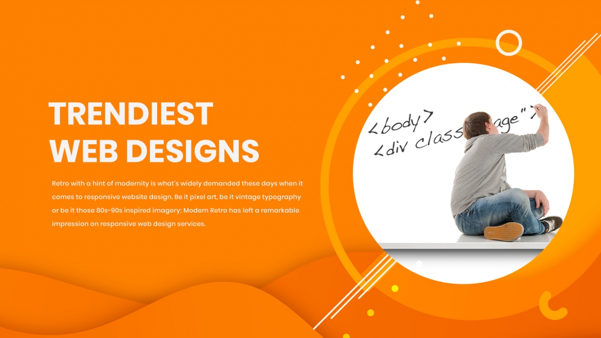
Retro with a hint of modernity is what’s widely demanded these days when it comes to responsive website design. Be it pixel art, be it vintage typography or be it those 80s-90s inspired imagery; Modern Retro has left a remarkable impression on responsive web design services. There have been quite a number of sites making the most of this style.

* Cinemagraphs

Cinemagraphs have been gaining popularity off lately because of its visual appeal. Cinemagraphs is nothing but still photos with factors that make recursive movements. Cinemagraphs can be anything from a basic GIF file to a brief video. However, even a teeny tiny video will make for a large file size owing to the high quality of the cinemagraph.

* Material Design

Google’s very own Material Design has been in the responsive website development and responsive website design arena since 2014. It operates on the fundamentals of paper and ink that is further translated into a digital format. With a package full of themes and templates crafted exclusively for CMS as well as front-end frameworks, Material Design has gained remarkable popularity within the past few years. One consistent con of implementing Material Design you will ever hear is that all the sites developed implementing it seems like a clone of one another. 

* Bold, Creative Typography

2016 has been an eventful year in terms of seeing some creative implementations of typography. And the league is expected to be carried on in 2017 as well. As designers push the boundaries with type, you can expect to see more creative typefaces than your usual web fonts.

Combining the prowess of typography and video, Nurture created an enticing website. A video runs in the background, visible only through a single large letter from the word “NURTURE”. The video, along with the letter keeps on changing as you navigate through each section of the homepage.

You can refer website of FRIENDS, a design agency based out of the USA. Their website used the big and bold type that highlights itself as the main feature.

* Modular Design

Modular design, though it has been around for a long time, has now been gradually gaining popularity over the last few years. It is a design approach that utilizes a modular, block grid pattern to layout elements. According to Google Trend data, a search query for ‘modular design’ has been on the rise since 2011, and I expect this growth in trend to continue in 2017 as well.

Refer BUILD IN AMSTERDAM’s website as an ideal example of a modular design website. This approach helps them define each content element clearly.

* SVGs

Aren’t you tired of logos and image resizing yet? Doesn’t the time and effort it takes feel inconsequential? In this case, it’s time you ditch the usual PNG and JPG formats and try out SVG format. Please note that SVG doesn’t work with all images, you can’t just infinitely scale any photos you want. SVG works best with vector graphics, logos for example.

Even though PNG and JPG formats have been used extensively since long time, recent Google Trend data points out that search query for SVG has been on the up since 2013 and this growing trend will remain unchanged even in 2017.

The reasons why SVG image should be used are because they render seamlessly no matter the scale and the file sizes are comparatively small that contribute to improved page speed.

Check out WPMUDEV logo on the lop left corner of their website. If you zoom it, it won’t get pixelated. It remains sharp and clear no matter how much you enlarge it.

* Flexbox

Flexbox, aka CSS3 Flexible Box, is a CSS3 layout mode that ensures each element behave efficiently and predictably when the page layout is displayed on varying screen sizes and devices. Flexbox is now supported by most modern browsers and is steadily garnering interest among front-end developers. For more information on Flexbox, it is recommended to refer guides such as Understanding CSS3 Flexbox for Clean, Hack-Free Responsive Design and Understanding CSS Grids for Modern WordPress Website Design.

* 360 Video & VR

2016 was the year when a large number of gaming VR headsets were released and 360 video had seen a rise in search interest. Surely one can expect to see VR videos incorporated into websites in near future. Google VR View, a javascript API that can help you add 360 video to your website, can make this happen. You can experience 360 VR through movies and games like Blair Witch and Resident Evil 7 respectively. It is best experienced on mobile using a VR headset for mobiles.

* Microinteractions

Any user interaction with the website can be considered as a Microtransaction. These interactions can be anything such as filling a form, sending a message or even liking a post. The main purpose of these microtransactions is to provide feedback and guidance for the user, contributing to improve UX.

Microtransactions have gained tractions in recent years with users getting more creative and innovative in ways of providing feedback and guidance.

Wrapping Up

So here we conclude with the web design trends to watch out for in 2017. We are hopeful that you have got a fair idea about what designs to take inspiration from. So now that you know, go relish in responsive website development with cool new patterns and web technologies.

Use Of Responsive Web Design To Boost Conversions

Use Of Responsive Web Design To Boost Conversions

With the changing technology every day, the accessibility and awareness of technology have increased amongst the users tremendously. The technology has reached people in various forms and devices. Depending upon the affordability, people own different types and sizes of devices.

Due to the increased awareness, accessing the social media, online shopping and browsing internet has become a habit for almost every person, whether he is coming from the corporate world or is a student. In the light of this, it is quite not possible that the websites are designed separately for each device type and compatible with the software used on the device.

Responsive web development takes care of the variations concerning the screen sizes and the software applications by adapting itself to the different devices. Responsive website design enables the users to access any particular website on any device without any hassles.

Responsive web design services should be in conformity between the design and development. The user’s action and environment depending on the type of devices, mechanism and arrangement should be taken into account while developing a responsive website. The highest accessed web search leader, Google has affirmed it prefers to use responsive web design as the mobile configuration.

Most picked cues for creating a responsive website design effectively

Approach based on mobile devices

Due to the changing technology, every individual affords to own a smartphone or portable tablet device for keeping himself abreast of latest developments. So, it becomes imperative to target the audience owning the mobile/tablet devices for designing of the responsive website.

Emphasis on the touch technology

The latest smartphones are produced based on the touch-enabled design. The touch technology enables smooth navigation through mobile for the users. Designing of buttons for easy selection and click can be efficiently created for navigating the page in all directions using the touch technology.

Employ Design Prototyping Software

Design prototyping software is primarily used to provide actual time performance, the record of changes, mapping the audiences. The software simplifies the interaction between the client and the designers. It becomes easier to analyse the responsiveness and interactivity of the website design.

Bootstrap – a free and open-source front-end framework

Bootstrap is a front-end web framework used for designing of websites and web applications. Bootstrap supports responsive web design in which the layout of web pages changes dynamically, bearing in mind all the features of the device used e.g. desktop, tablet, mobile phone.

Google’s Resizer Tool

The Google’s Resizer tool offers the capability to test web design across different platforms and devices and identify the breakpoints therein. Resizer is a helpful tool used to modify the web designs apt for various devices.

Responsive Web Design Typography

Responsive Typography is introduced in Responsive Web Design such as column width, type size or line height across various devices to use of graded fonts that match with the tone of the website.

Media Queries

Media Queries is useful in deciding the width of the design layout in disparate devices. Three media queries should be determined for a web design considering mobile, tablet and desktop.

Fluid Grids Layout

In a responsive web design, the layout of a website needs to respond and adjusts to the size of the device on which it is laid out. A fluid grid layout presents a visual approach to create different layouts analogous to devices on which the website is visible.

Effortless Navigation

Without having an effortless navigation, it does not matter how creative the website is. Navigation within the responsive design is distinctive because there are varying screen sizes for which the navigation options need to be provided.

Enhance the creativity of website

In order to engage more audiences to the website, it is essential to create an attractive content and layout. The content and layout of the website including images to the typography must be aligned with the theme of the website with a spark of creativity.

Content congestion

Too much of a content can destroy the creative look of a website. The information presented on the website should be useful, relevant and placed in an organized manner. The content should be structured under appropriate captions that hold the interest of the users.

Retaining Quality with Efficient Download Speed

Users want to have high-quality images loaded fast on a webpage. In order to attract more audience to the website, it is essential to integrate Google AMP to enhance the SERP for faster loading of the webpages.

Flexbox

Flexbox is a container that holds internal elements. Flexbox is extensively used for mobile devices and responsive content for influential layouts and web apps. The internal elements are left fluid and are not given definite width values but instead, the content adapts with the page based on proportions.

Material Design framework

Material Design Framework is a user focused approach which utilizes elements and principles of Material Design. Using Material Design, a framework can be created that integrate components and animations for providing additional feedback to users.

Along these lines, it is acknowledged that creating a responsive website is a prudent initiative for building an attractive website and at the same time getting higher conversions by applying the above-mentioned cues.

10 Top Tried-And-Proven Tips To Run A Woo-Commerce Site Successfully

10 Top Tried-and-Proven Tips to run a Woo-Commerce site successfully

WooCommerce, a free plugin that lets you sell products and services from your WordPress site. It was acquired by Automattic Inc., WordPress’s principal company recently. It is one of the best-designed e-commerce plugins for WordPress and is considered as a most popular eCommerce solution across all websites.

So now that you’ve implemented Woo-Commerce to your responsive eCommerce website, what are the steps you can take to turn your online storefront into a successful business?

Here are the 10 Tried-and-Tested Tips that will help your Woo-Commerce site run successfully:

10 Tips To help your Woo-Commerce site run successfully

Appeal with Photos

Entice and appeal to your customers with high-quality photographs of your products and take an important step to guide your customers towards making a purchase from your store. When potential customers visit your product page, it’s because they want to have a look at your product; show it to them with large images from multiple angles with a consistent style and settings. Give them complete control by letting them zoom in on your individual images and cycle through multiple images; A Lightbox plugin can make this happen.

Set the Tone of your Brand

Don’t be a plain online store that just sells products or services! Stand out from the crowd and connect with your customers. Show off your brand’s story and personality by setting a tone of voice that is throughout your web pages, product descriptions, and blogs. Show them why your brand is unique!

Always remember that great brands aim for customer’s hearts and not their wallets!

Create Great Content for your Customers

The design of a website is essential in building a good first impression on your visitors, but it’s the high-quality content that helps retain them and gain high ranking on SERPs. Focus on content that talks about your customers’ needs and how they can get the best out of your products and services. Share the story of your brand and elements of your business through your blogs. It is recommended while preparing product description that you focus on content that helps your customer understand you and your products/services better and why you are a good choice for them. Make use of good cases and address questions that your customers may have.

Connect with Newsletter

Believe it or not, Email marketing is still relevant and is still one of the favorite modes of communication for marketers. Marketers still prefer to reach their current and potential customers through Newsletters detailing their products, services, events or offers. Target and customize your emails based on users’ habits and purchase history to get the best returns. Track the behavior of your audience – links they have clicked on, why they choose to unsubscribe and how often they forward your emails.

Grow with SEO

For an online business, SEO (Search Engine Optimization) is essential to increase brand visibility and credibility. When people search online for your products or services, having your website at the top of the SERP builds trust. Optimize your website by adding the right keywords in the content to generate more traffic from diverse sources and affect the revenue of your ecommerce store.

Use the basic WordPress SEO by Yoast, a complete SEO solution provided by WordPress that adds Meta descriptions, keywords, and optimized permalinks to make sure search engines know where your content is.

Support your Customers

Customer support is crucial to running an online store. It isn’t just about helping them solve problems related to shipping or refunds, but it’s more about making them feel comfortable on your website.

Answer their most common questions related to pricing, guarantees, offers and policies that they might have, preferably in FAQ format and encourage them to contact you whenever they feel stuck through a contact form or live chat.

Give Olark a try; it is easy to install on any Woo-Commerce site and you can even try it out for free.

Special Treatment for Special Buyers

So your business is running like a well-oiled engine and you’ve started developing a strong customer base. Why not offer your customers something special and give them a reason to visit and shop through you again?

Wishlists

Offer your customers a chance to prepare their wishlist so they can choose the keep the product aside and make the purchase later when it’s convenient for them. WooCommerce site Wishlist allows you to create and add products to an unlimited number of Wishlists and so much more.

Vouchers, Coupons and Store Credit

Give your visitors complete freedom on they choose to spend their money whether it’s through vouchers or free credits. Let your customers purchase a product as a gift voucher for them to gift their loved ones. Provide special offers to your current customers and let them know through emails or any social media channels. You can also set up a store credit system to make the purchase process easier for them.

Use Smart Coupons extension for WooCommerce to get an all-in-one coupon solution for your eCommerce site. Whether you want to offer store credits, generate coupons for promotions or allow gifting, this extension will make your life so much easier.

Secure yourself with a Backup

Always remember to backup all your files and content. You never know when your system might need to be updated or when you might fall victim to a hacker attack. It is highly recommended to keep your data updated to keep the downtime to a minimum.

Get your eCommerce site protected and prepared with real-time automated backups through VaultPress specially optimized for WooCommerce websites.

Allow Speedy access with CDN

Fast-loading websites have reduced bounce rates, improved user experience and higher ranking in SERPs. CDN (Content Delivery Networks) services can take care of delivering heavy files like images and CSS sheets from a server geographically close to the user and optimized for speed, thereby substantially reducing page-load times and giving your website a huge boost.

Use MaxCDN which is reliable and offers competitive rates.

Get Users to participate

Today’s buyers love to share their views and reviews, especially on social media platforms. Let your customers share their reviews and ratings on your products and services on your websites and let everyone know what they liked and (what they didn’t). These reviews can give you good insight on what is working for you and where you can improve to increase customer satisfaction. A report shows that 85% of online shoppers will make a purchase only after reading online reviews.

Use Review for Discount and Testimonials by WooThemes that allows your customers to give you reviews and testimonials respectively for your WooCommerce-powered website.

Conclusion:

With Woo-Commerce integration and these 10 Tips shared above, we hope you get your eCommerce website up and running successfully.

Potenza Global Solutions is a WordPress Development Company that offers responsive website development and custom eCommerce development among other IT solutions.

Use Humor in Responsive Web Design to Engage With User

Use Humor in Responsive Web Design to Engage With User

Remember when you are ordering food online and you have to wait for quite some time while the portal corroborates your credentials given in the payment gateway?

While there is just one thing going on in your mind- FOOD, there’s a lot happening behind. Or recall a time where the portal is loading the requested page and you have to wait. Tiring, isn’t it? Well, these situations have got into our nerves at some point or the other. And all we have been taught since our childhood is being impatient and anxious. Also, recall a time when you come across an interesting anime or image with an equally catchy caption while the page is loading. Don’t you forget about the food you have ordered or the payment you were trying to make for a moment? Especially, when those tiny little images or anime has a touch of humor, it gets way more interesting than expected.

Ever tried the dinosaur game that appears while Google has issues loading its page owing to the bad network? If you have tried your hands on it, you must know how addictive the game gets once you are in the middle of it. People are even found wishing the google page doesn’t gets loaded somehow. That’s the effect of web design in a humorous and fun way! And that’s an apt example of influential responsive website design.

While offering responsive web design services, humour becomes an important aspect. After all, it adds all the fun and vibrancy to a different arena. Studies and researches have found so many positive benefits of humor. It aids to a person’s psychological and mental well-being, improves tolerance and reduces stress. We have all come across certain instances where humor has uplifted our mood after a tiring deal of the day. Humour adds colors to relationships and emotional good beings as well.

The slowing down method!

In what way you utilize humor is an attempt to engage users during the entire slowing down process and not let them feel for even a second that their online proceedings got slowed. Researchers address to this as “elaboration”, a one-word substitution for paying keen attention. Users elaborate to humorous texts, images, and even small anime because any incongruence or violation in the guidelines requires closer scrutiny to proceed the message. It is also acclaimed that implementing comedy or humor in order to slow users down can actually enhance the all over experience. Also, in terms of processing of information, we should not doubt about the outcomes or impacts on the usage experience. Once engaged the users with proper humor and comedy, they are least likely to notice the delay in information processing. This is valid until the user does not find the humor offensive or inappropriate. The benefits of engaging users in elaboration while they visit your portal are that it leads to an increase in the processing. It also makes easy for the user to recall your portal. If users are interested in the elaboration of your content and experience and they engage themselves for a longer period, then it is believed that users will have a much more memorable experience.

Humor: right place, right audience

During responsive website development, it is always advisable to use humor at the right place and amidst the right audience. Always keep in mind that humor can improve your relationship with your clients and users. Amalgamate your brand with humor as well as the needs of the user and make it look relevant enough. That’s all that is demanded by your humorous content. Humor is often found efficient as well as appropriate in benign situations like emails, newsletters, placing an order for food, updating profile information, to name a few.

What experts suggest is, no need to go overboard or let humor get over the top of your actual content until and unless it is not recognized and given attention towards. Therefore balancing between the quality of factual data of your content and the humor added to your content to engage users at time of slow processing is the key to an effective responsive web development.